Life gets crazy for everyone, and we are no exception.
Posts have been extremely rare and sporadic lately, but we want to assure that Flyer Goodness is not over. On occasion, we will continue to share great flyer designs and submissions, but just not at the same frequency that we once did.
Follow us on Instagram for random flyer and signage cataloging, and you can follow us on Twitter for random design links and anecdotes.
8.14.2014
12.17.2013
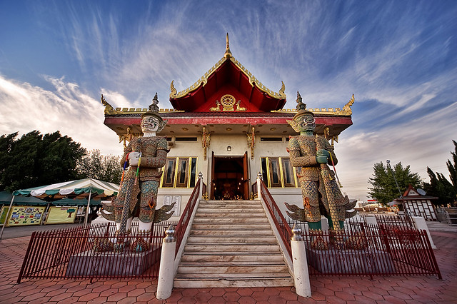
Thai Design


Pages I scanned out of a Thai design university textbook.

Certificate of monkhood.


Examples of Thai calligraphy from another monk, Tan Kwanchai, who has over 20 years experience.


Stage backgrounds and pieces done by the main artist monk Tan Patinya.
I had the rare opportunity to become ordained as a Thai monk for a month and lived as a monk at a temple in Los Angeles where I was able to retreat from my everyday routine in taking on a much simpler and monastic lifestyle. I've always admired the Thai accents on the temple and the Thai signage and stage art, and finally got to meet and talk to the monks that were responsible for the work. One of the younger and artistically skilled monks, Tan Patinya, is responsible for the art design at the temple and produces elaborate stage backgrounds for events as well as other design work like the above pictured Thai eaves in front of the house and his impressive Buddha statue of liberty piece.
I was able to scan some pages out of a Thai design book that I thought were pretty interesting. A lot of the influence in Thai design comes from elemental themes like fire and lotus leaves, where he shows me in a live demonstration on paper the basic design principles of how everything stems from 3 initial curvatures and then proceeds to accentuate more detail based off those three curves or baselines.
Subscribe to:
Posts (Atom)